Frequently Asked Questions
YOUR QUESTIONS ANSWERED
How much will it cost?
As nearly all our signage projects involve bespoke designs there are no standard prices. We will assess factors in each signage enquiry and price our products accordingly to suit both the project and your budget. We can often suggest several suitable materials at different price points.
Below are some example prices for common signs, they are intended as a rough guide only and are based on a straightforward one or two colour design.
It is our aim to be competitive and accommodating in our approach to your signs. We wish to build on our 25 year+ trading history by expanding our customer base and maintaining and building existing relationships. We do this by standing by our products and offering good value for money.
We believe that quality and service are the long term virtues we wish to be known for. We will always welcome the opportunity to negotiate if a competing like-for-like written quotation is provided, but we will not sacrifice quality or our reputation to achieve this.
Below are some example prices for common signs, they are intended as a rough guide only and are based on a straightforward one or two colour design.
| PVC 3mm 900 mm x 600 mm | £35.00 to £55.00 |
| PVC Foam Board Sign 10mm 900 mm x 600 mm | £65.00 to £85.00 |
| Small Van (Escort) | £90.00 to £200.00 |
| Medium Van (Transit) | £150.00 to £350.00 |
| Luton Van (7.5 Ton) | £250.00 to £500.00 |
| Flexible PVC/ Vinyl Banner 3m x 0.5m | £75.00 to £100.00 |
| Flexible PVC/ Vinyl Banner 6m x 1m | £150.00 to £250.00 |
| Shop facia non-illuminated 5m x 0.9m (Budget) | £300.00 to £400.00 |
| Shop facia non-illuminated 5m x 0.9m | £600.00 to £800.00 |
| Shop facia illuminated light box 5m x 0.9m | £900.00 to £1200.00 |
| Shop facia specialist fabricated 5m x 0.9m | £1500.00 to £3500.00 |
It is our aim to be competitive and accommodating in our approach to your signs. We wish to build on our 25 year+ trading history by expanding our customer base and maintaining and building existing relationships. We do this by standing by our products and offering good value for money.
We believe that quality and service are the long term virtues we wish to be known for. We will always welcome the opportunity to negotiate if a competing like-for-like written quotation is provided, but we will not sacrifice quality or our reputation to achieve this.
I need a quote - how do I get one?
By far the best way to get a quote for a sign is by using our Quick Quote service which promises to respond to your request within 2-4 business hours with a professional and accurate quote for the signs you need. You can attach artwork and there is a comprehensive guide contained within to help you specify the correct details/description.
QUICK QUOTE
How long will it take?
| Computer cut vinyl text | 1-2 days |
| Simple two-colour small sign board |
1-3 days |
| A-board | 2-3 days |
| Small PVC Banner |
2-3 days |
| Site safety boards | 4-5 days |
| Digitally printed PVC Banner | 4-5 days |
| Etched and Engraved Plaque | 7-10 days |
| Non-illuminated shop facia |
7-10 days |
| Illuminated shop facia | 12-14 days |
| 3D Illuminated Neon Letters |
3 weeks |
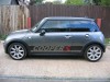
| Cut out vinyl designs for cars | 1-2 days |
| Cut out vinyl designs for vans | 1-3 days |
| Magnetic panels | 1-3 days |
| Digitally printed graphics | 2-3 days |
| Lorry and HGV | 4-5 days |
| Full body vehicle wraps | 5-7days |
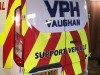
What type of signs do you make?
Big signs, small signs of every type for buildings and offices to cars and vans. If it is referred to as a sign, from the smallest engraved plaque sign to 100 ft flexible banners installed seven stories high we are able to manufacture all types of signs in all types of materials, contact us with your requirements.
We aim to design and manufacture signage that leads the way in business using unique materials, state of the art technology and our years of experience in the trade to add real marketing value to your business.
We aim to design and manufacture signage that leads the way in business using unique materials, state of the art technology and our years of experience in the trade to add real marketing value to your business.
How do I send you artwork?
Artwork can be accepted in many formats. A quick way to send us your files and pictures is by using our Quick Quote service. Using Quick Quote, you are able to attach up to 10 files at a time with a total file size limit of around 50 MB, you can also email or use one of the many file sharing sites (such as Dropbox).
Cut ready artwork is preferred in a vector format with any fonts converted to curves or outlines (as applicable depending on the software that you are using).
Below are some of the common file types we can use to create your sign. However, do contact us if you have any queries about how to save or deliver your artwork to us.
Preferred cut ready vector formats: Illustrator (.ai or.eps, .pdf).
Other formats we can accept, though may require further design work to adapt the artwork appropriately, are Photoshop (.psd), .Postscript (pdf), .jpg, .tif, .bmp and Word (.doc/.docx).
I don't have any digital artwork - can you help?
We offer a comprehensive design service able to recreate existing artwork from your hard copy or software original or create a whole new corporate image from an initial concept.
Artwork adaptation from good quality, customer supplied cut or print ready originals is included in the overall cost of your project though any further time consuming work will generally charged at an hourly rate. We will of course always try to give an outline estimate of any additional costs in our initial quotation.
Do you do site visits?
Yes, we can arrange to meet with you at your premises to discuss requirements and to survey your project. This is offered as a free service as we are confident that our vast experience and sound advice secures a high percentage of enquiries. If you are looking for inspiration or to view further samples then a visit to our design showroom is recommended where, using the latest sign making software, we can bring your ideas to life.
Can I see the design before I buy?
We provide a full proofing service and will offer scale drawings in colour to enable you to feel confident with the finished signage before you make a commitment to your final choice. Our proofing service is totally free of charge and designs can be viewed at our in house design station, some restrictions may be applied to releasing artwork from the premises.
Are discounts available if I order in bulk?
Often multiple print jobs will merit quantity discount depending on the method of production. Ask at the time of order and we will be happy to negotiate a package price.
How can I pay for my signs?
We accept payment by bank transfer, please request our bank details if required.
We also accept cash, cheques and debit/cards at our showroom in person and debit/credit cards over the phone to suit your requirements.
Terms & Conditions
All prices are quoted Net of Value Added Tax at current rate. Quotations are valid for 60 Days from date of Quotation.
Orders are only accepted in the following ways
a: Non-account customer orders will only be accepted with A 50% Deposit at time of order.
b: Account customer orders should be verified in writing or be accompanied by an official purchase order.
By supplying either of the above the customer enters into a contract of sale and agrees to all terms and conditions as submitted.
The final balance of payment, if outstanding, is due immediately on completion of work unless agreed otherwise and confirmed in writing.
Orders for screen-printing, etching, engraving, garment embroidery and printing, or on request are to be paid for in full at time of order being placed.
All goods, services and fixings will remain the property of and can be reclaimed by Action Signs until full and final payment has bee received and has been cleared,
The customer shall remain a bailee only and title of goods remains with Action Signs until final payment is made and has been cleared
After an approved length of time and a sufficient volume of trading a credit account can be applied for subject to further terms and conditions, available on request.
What guarantee do you give?
We stand by and fully guarantee all permanent installations for 12 months any defect caused directly by our own negligence or material failure and will repair or replace any item that is identified to be at fault within this time. We expect all of our signs to have a long shelf life and depending on production method and materials used, most signs, with regular care and maintenance, will last between 7 and 10 years.
Unfortunately, consumable items like lamps and tubes are not covered under this guarantee as their useful life cannot be determined, due to varying use.