Catastrophic Kerning
Kerning refers to the space between two letters or characters and it is extremely
important when it comes to making your typography look right. This is
particularly true when it comes to large and highly visible signage.
Due to letters having very different shapes and many possible combinations it is
paramount that each pair of letters fit together well, as to not be distracting or
off-putting. Our designers know which letter combinations often end up
awkward-looking, and adjust typography accordingly to ensure customers and
clients can appreciate your brand. Combining characters in the most
aesthetically pleasing way is too-often overlooked. When it is it can lead to some
pretty catastrophic, and sometimes amusing, results.
Graphic designers at Action Signs understand the consequences of careless
design, and how it can present an otherwise professional business to be lax and
sloppy.
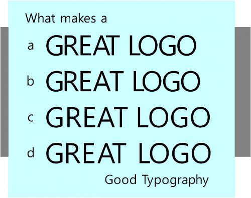
At first glance, the text GREAT LOGO might appear correct until the subtle kerning mistakes are pointed out.
- a. Is correctly kerned
- b. Has one common kerning error the relationship between the A and the T is too great.
- c. All letters are incorrectly kerned
- d. Is correctly kerned but extra space has been added to reduce the weight of the text.
Whether it be vehicle graphics, logos, stickers, banners, shop signage or
anything else that represents your brand – our team are committed to delivering
great quality design that never fails to make a lasting impression.
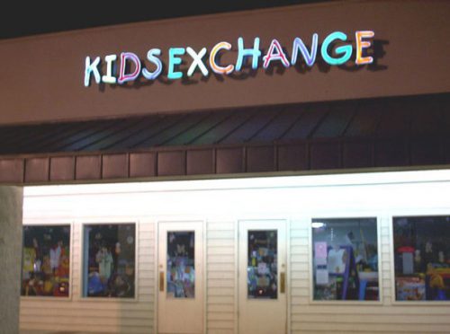
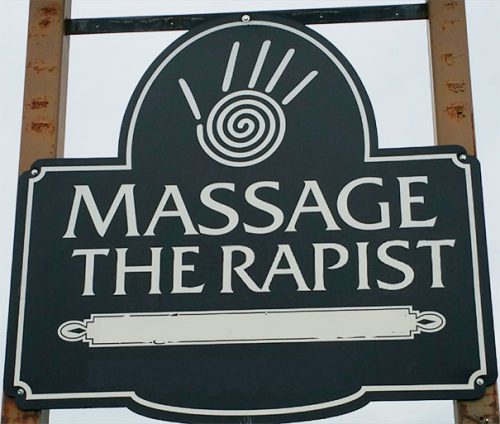
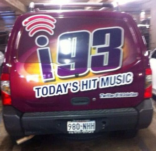
Getting it right means understanding where others have got it wrong. Here
are some examples of designs that certainly make an impression, but
probably not the type you’re looking for.